Designing business cards that get noticed is a fun process - at least for me! I've seen thousands of various cards so far, and most of them were quite dull. But some of them really stand out, making a lasting impression and helping their owners score quite a few points.
Business cards have a limited size, though. They are about 3.5 x 2 inches, and if you've got a lot of info to print on them, you may get frustrated. The solution is to use the cards with the goal of presenting yourself as a skilled professional, rather than try to include everything under the sun (company history, etc.).
Be sure to adapt the card design to the business that you are supposed to promote. If you run a travel agency, for example, it's best to use bright colors, rather than gray and black. Of course, gray would work perfectly for a company that provides consulting services, for example. It's a color that is associated with practicability.
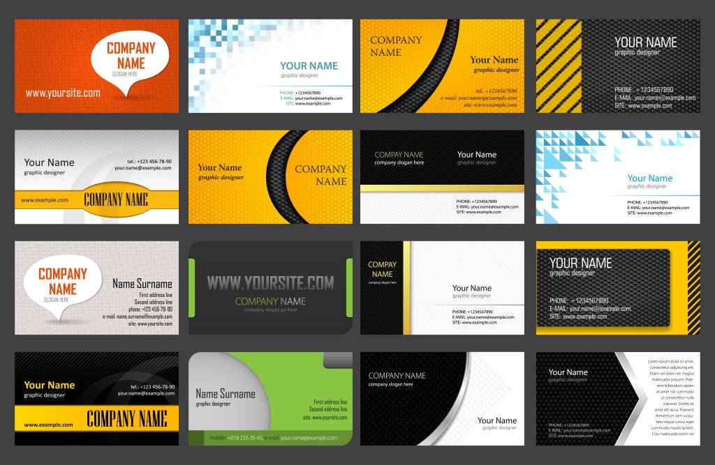
Here are a few examples that show the type of quality that you can get by working with us.
So, what are you supposed to do if you prefer to design your own cards, but lack the needed graphic design abilities? For starters, look at all the business cards that you have received all these years. You have probably stored them somewhere, haven't you? So, grab them all and see which ones would look great for your business.
Of course, your logo should be incorporated. My strong recommendation is to ask a professional designer to create your logo. Go for a model that's simple and easy to remember - it's exactly what big companies do! Sure, there are several online logo maker services - this one, for example - so you can also go the less expensive route if you really have to. Remember that changing your logo later on can be a painful process, and may confuse the existing clients.
What else should you add to the card? Start with your name, company name and title. Then, add your phone number, email address and website address. Choose a font that is really easy to read, because all these characters are going to use a tiny font. While we are here, be sure to use a single color for all the text. Okay, if you really want to emphasize something, you are allowed to use two colors - but never more than two!
Paper is everywhere, so most people assigned little value to it. So, if you want your card to stand out, it may be wise to consider printing it on plastic, wood, metal, and so on. It's more expensive, but it's a guaranteed way of attracting anyone's attention.
No matter what design or material you choose, always be sure to double check your work before sending the cards to be printed. I know, you may not have the latest and greatest laser printer, but you should try to print a card and see how it looks. Does it have the proper size? Can you read all the info on it clearly, without using your reading glasses? If the answer is affirmative, you may have a winner.
But before throwing a party, show your card to some of your family members and friends. Find out their honest opinion about it. Only ask them what needs to be changed. You may be in for a big surprise!